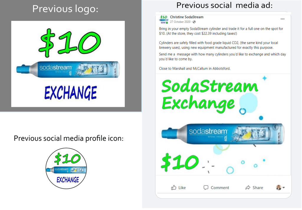
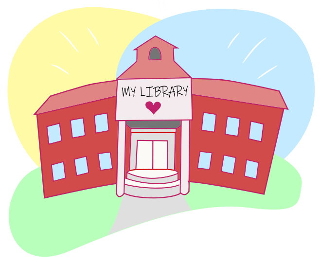
Update company name and logo with simple branding (Facebook ad only), emphasizing brand values of being friendly, local, and convenient, with a target demographic of women age 35 – 55 who use SodaStream, a beverage carbonation product.
The old brand:
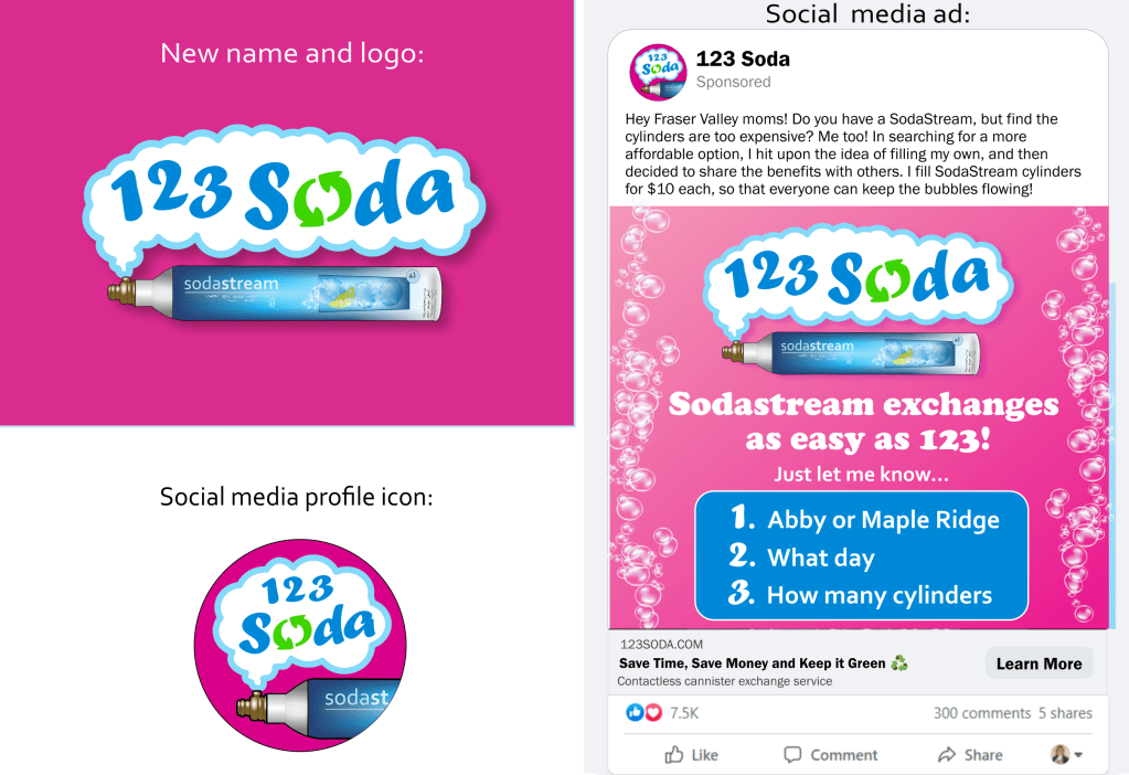
The new brand:
Reception: the client was very happy with the new look, which allowed her to promote her home business with a professional first impression.
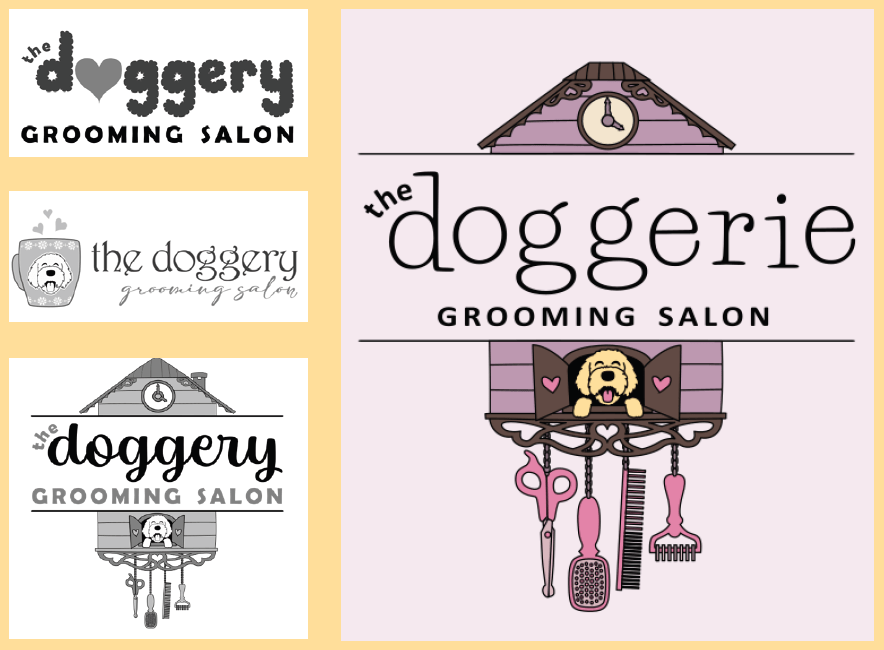
A playful, quirky logo appealing to a target demographic of “doodle” owners (curly haired poodle mixes), emphasizing the grooming salon experience as safe and welcoming for new and existing clients
Logo proposals and final logo:
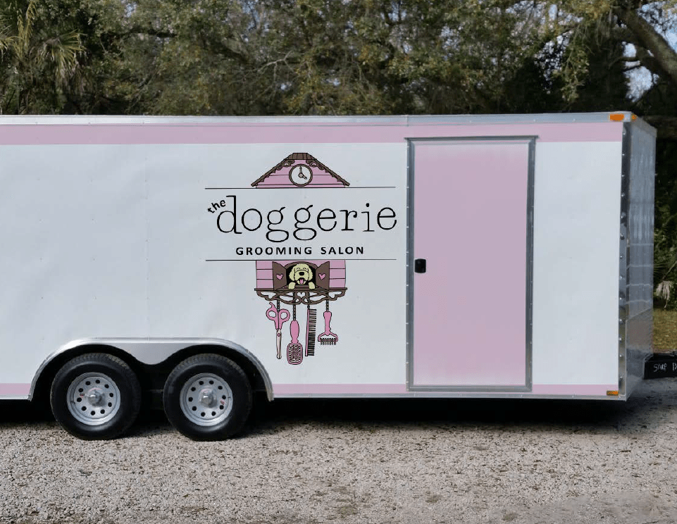
Reception:
The client was thrilled with her new logo design, and it was well-received by her client base, giving her a firm foundation for promoting her unique brand.
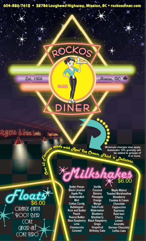
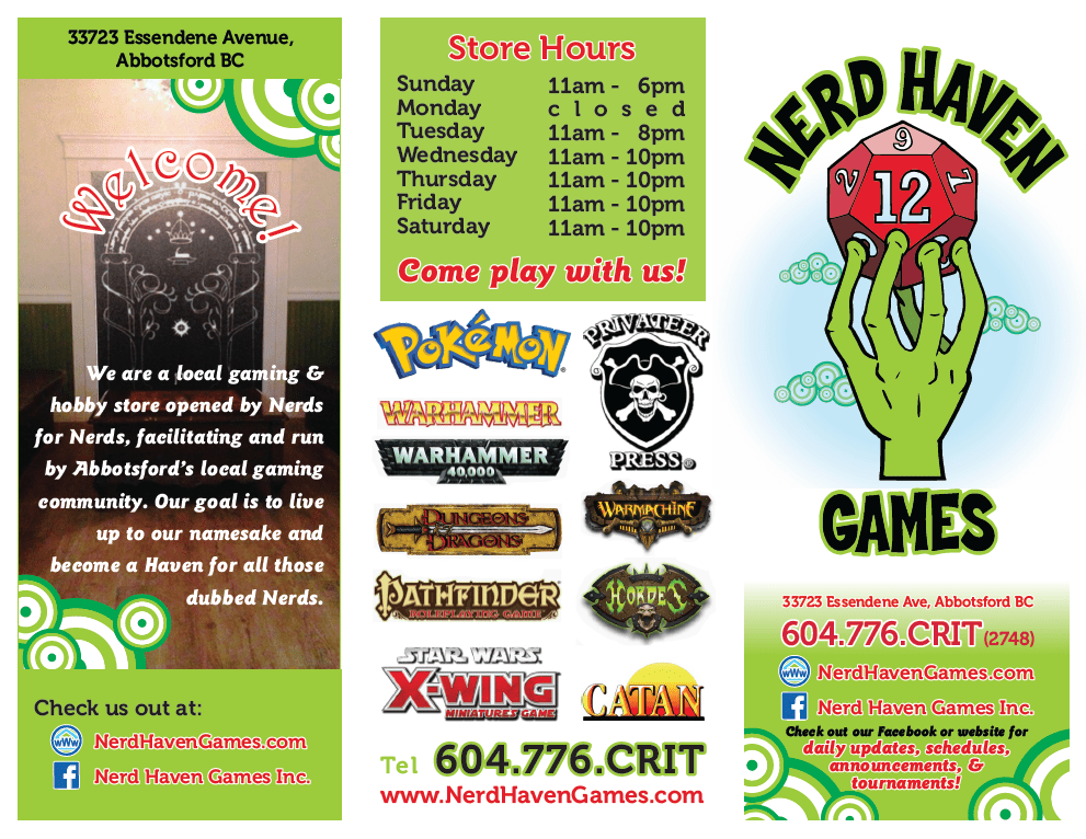
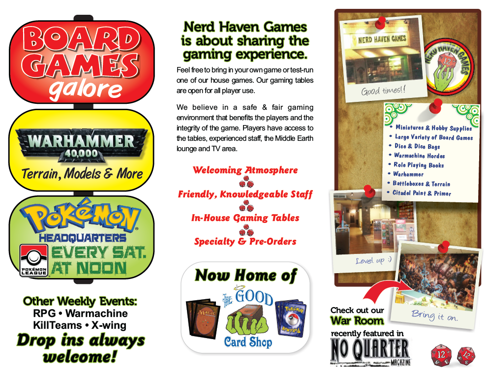
Create a printable, trifold services brochure for a game shop, appealing to tabletop gamers and fans of board and card games, emphasizing a welcoming, inclusive atmosphere.
The design:
Reception:
The use of white space, including a “no bleed” design with white borders, allowed for cost-effective colour printing while still maintaining brand integrity. The client was extremely happy with the design, which highlighted their many products and services as a central hub for ‘nerds’ in a friendly, inviting way.
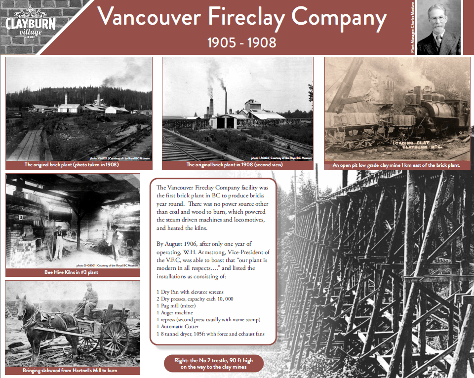
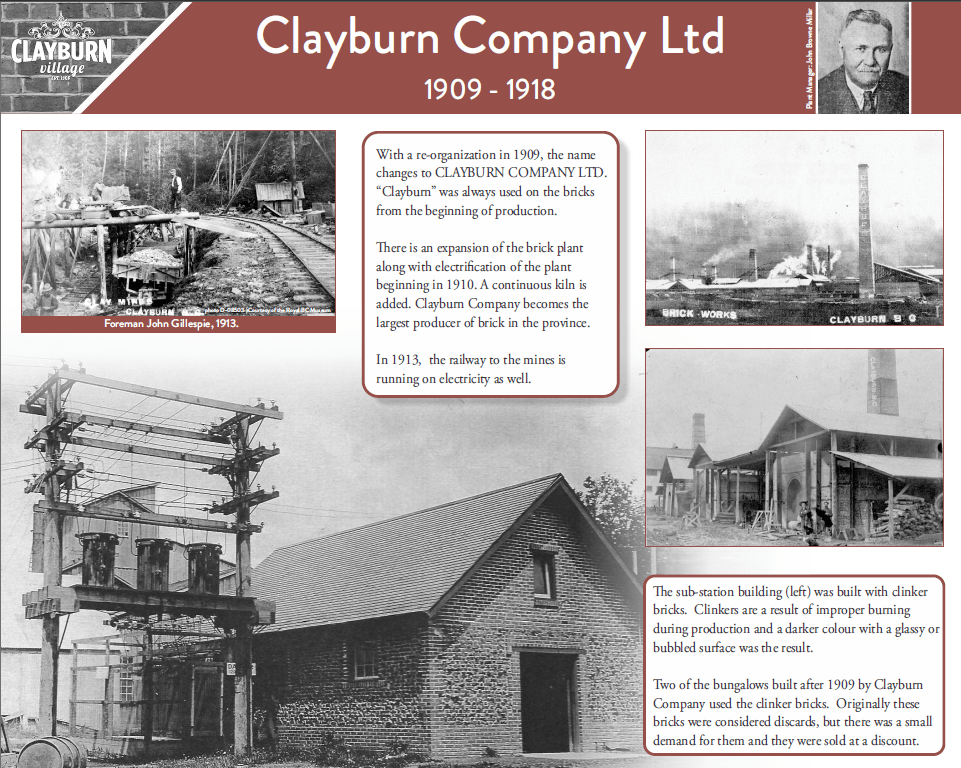
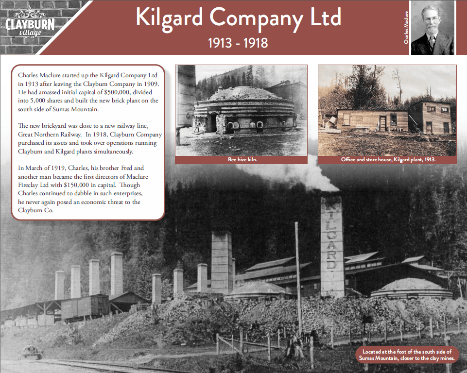
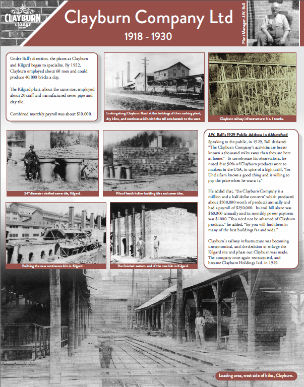
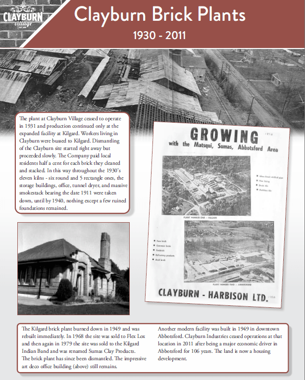
The Clayburn Museum Society commissioned these posters to celebrate and bring increased awareness to the long history of the Clayburn Village and surrounding area. They provided the photos, text, and desired colour scheme to coordinate with existing posters.
I designed the posters to be easy to read from a few feet away, while giving pride of place to the treasure trove of historical photos the client provided. I also provided some light text editing to ensure the meaning of phrases and flow of information were clear.
The brief: a modern, inviting logo and brand targeting queer and neurodiverse entrepreneurs, including website on WordPress with contact form.
The final logo:
The website was built through WordPress using BoldGrid templates and other add-ons, utilizing warm, inviting colours and textures along with short paragraphs and plenty of white space to ensure an easy reading experience. The main illustrations for the website were commissioned from @jayrettich, a young local queer artist who specializes in comic-style art.
Other collateral (forms, blog illustrations done by me):
The logo and website were well-received by the target demographic, providing a stable launching point for this new business.
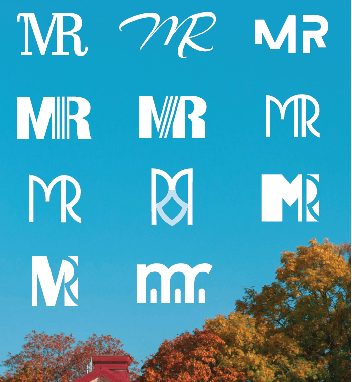
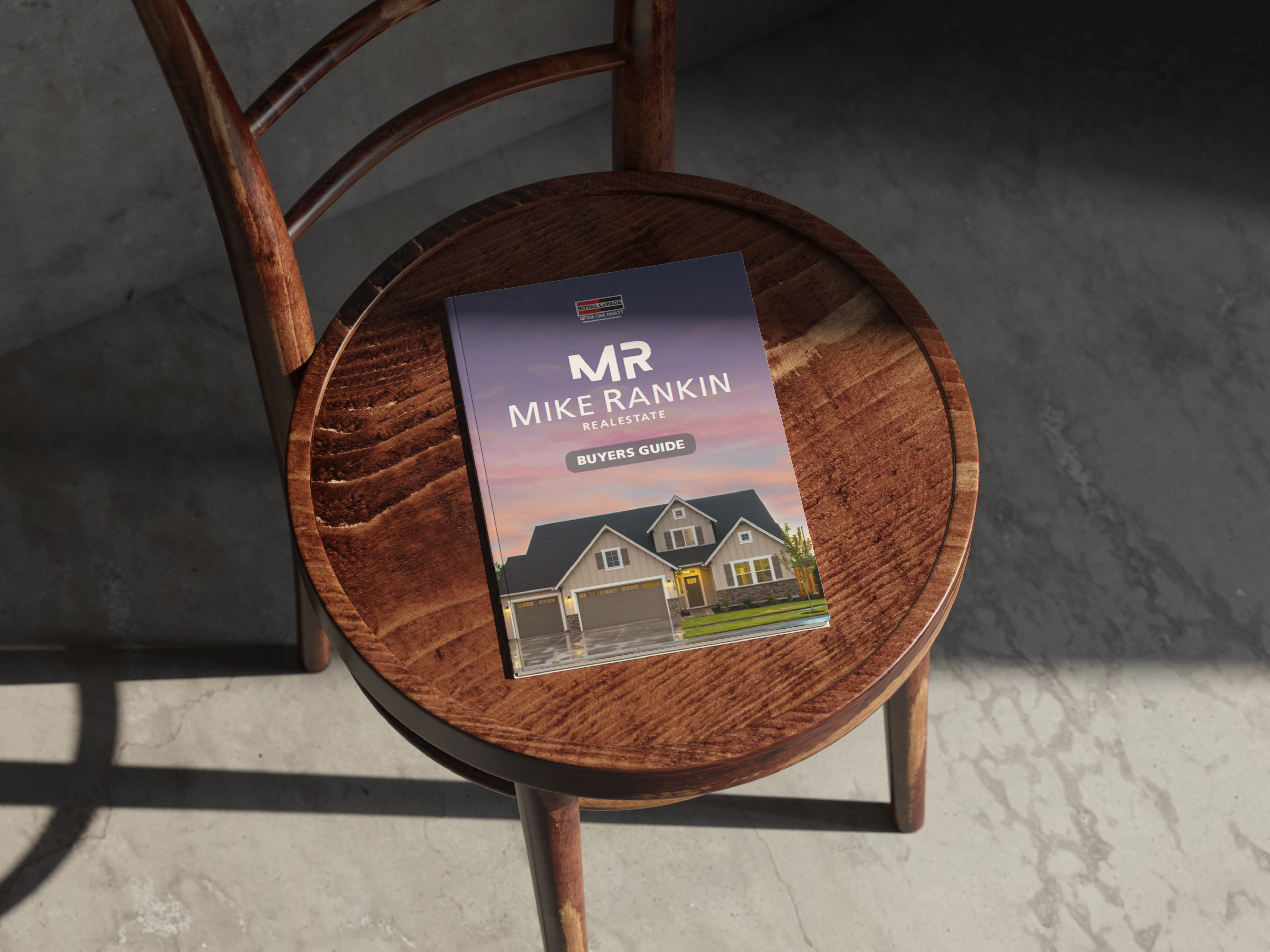
When Mike Rankin joined a local real estate firm, he needed to hit the ground running, with a simple, memorable logo, and collateral to match. Mike requested a logo that used his initials and avoided realtor logo cliches like house and key imagery. I provided the following options:
The top right version was his favourite by far, and I developed it out for his branding needs, sticking to visually similar sans-serif fonts for the logo wording and other assets.
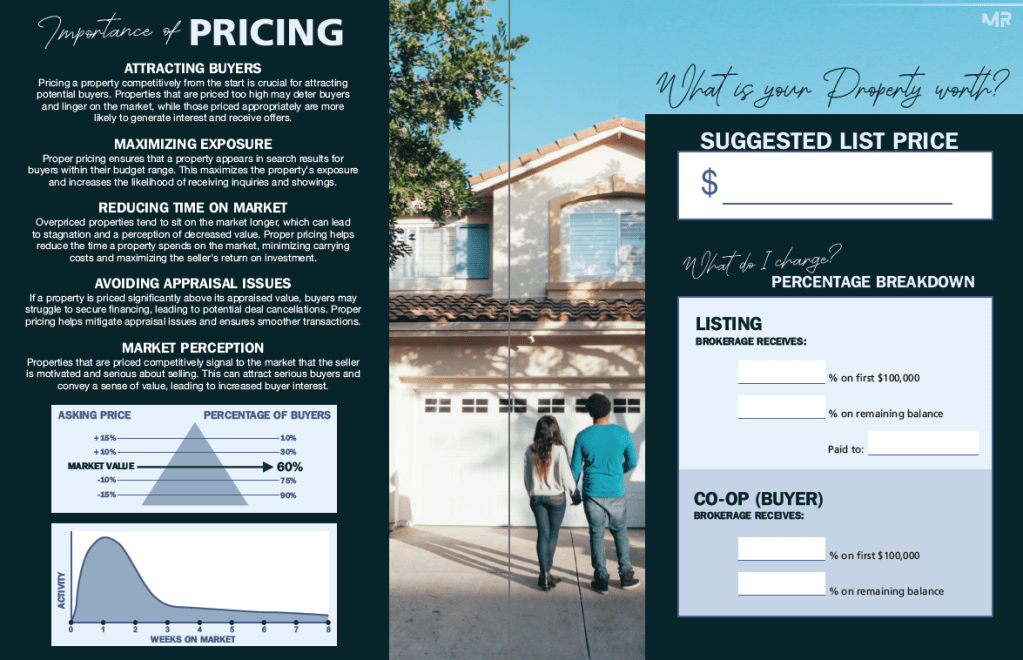
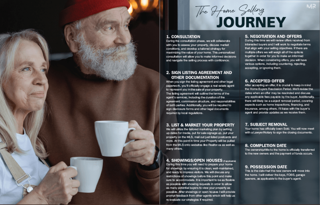
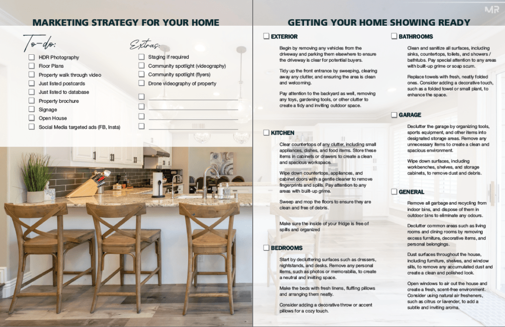
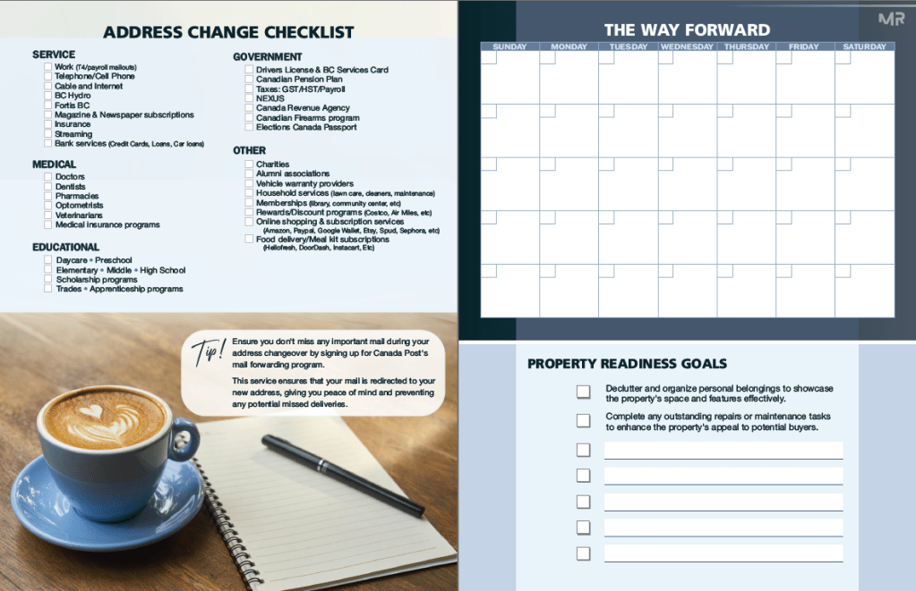
The most extensive single design project for Mike was the design of his Buyer & Seller Books, which provide a free guide for homeowners entering the market, while promoting Mike’s services as their potential realtor. Mike provided the text copy for the books, and I designed them page by page, incorporating his desired graphs, charts, and checklists, along with relevant royalty-free stock photos to enhance his message and increase reader appeal.
The booklets were designed for fold and staple booklet binding, a popular format for promotional brochures that is cost-effective to print and offers a seamless, magazine-like reading experience. Mike was very happy with the finished product, and now offers the items as a free download on his website, in addition to being an important tool for him at meetings with new clients.