
When Mike Rankin joined a local real estate firm, he needed to hit the ground running, with a simple, memorable logo, and collateral to match. Mike requested a logo that used his initials and avoided realtor logo cliches like house and key imagery. I provided the following options:
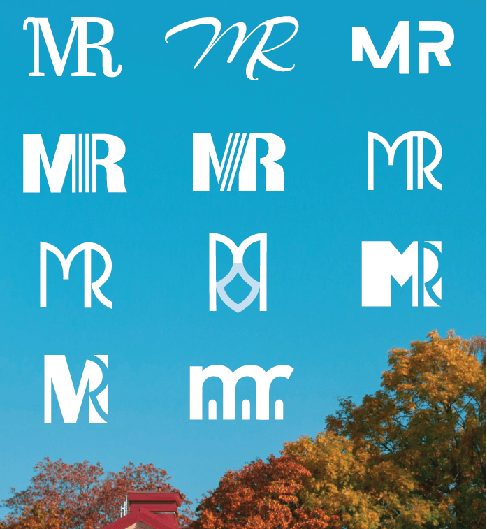
The top right version was his favourite by far, and I developed it out for his branding needs, sticking to visually similar sans-serif fonts for the logo wording and other assets.
The most extensive single design project for Mike was the design of his Buyer & Seller Books, which provide a free guide for homeowners entering the market, while promoting Mike’s services as their potential realtor. Mike provided the text copy for the books, and I designed them page by page, incorporating his desired graphs, charts, and checklists, along with relevant royalty-free stock photos to enhance his message and increase reader appeal.


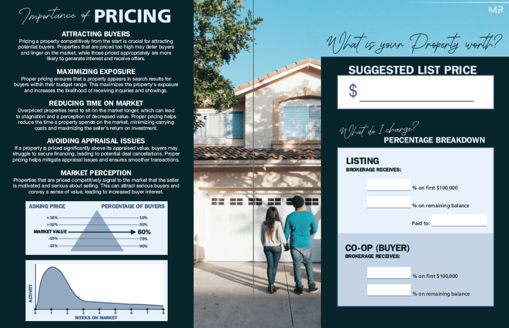
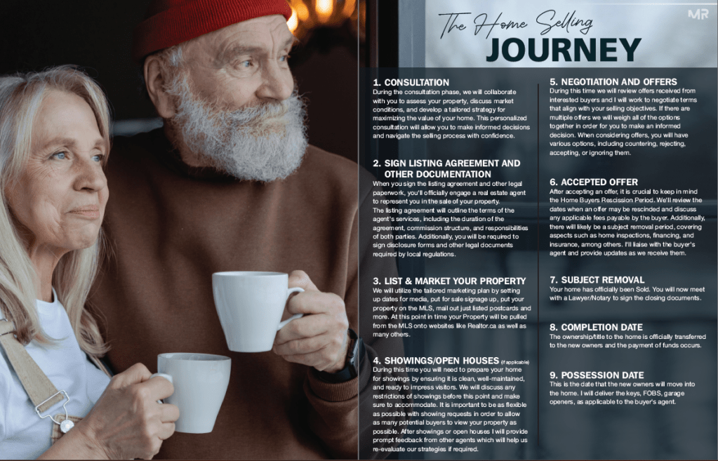
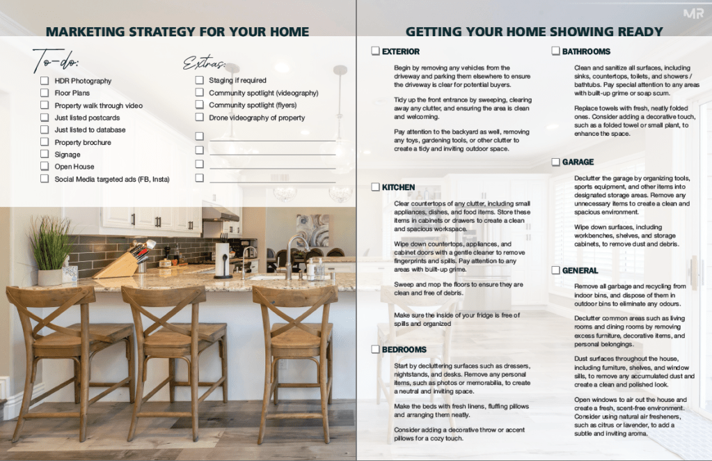
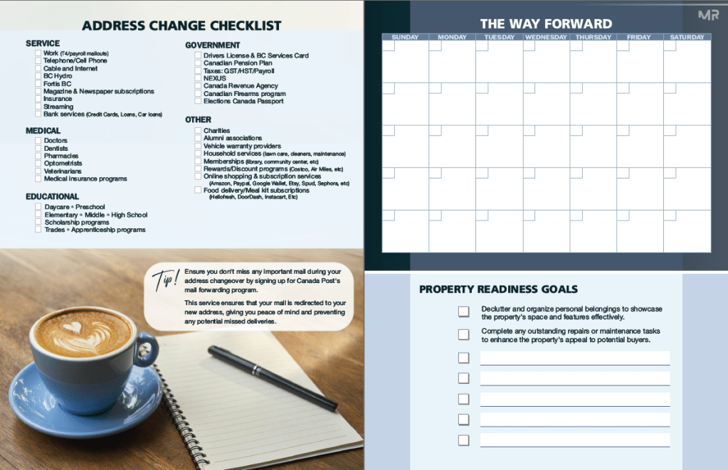

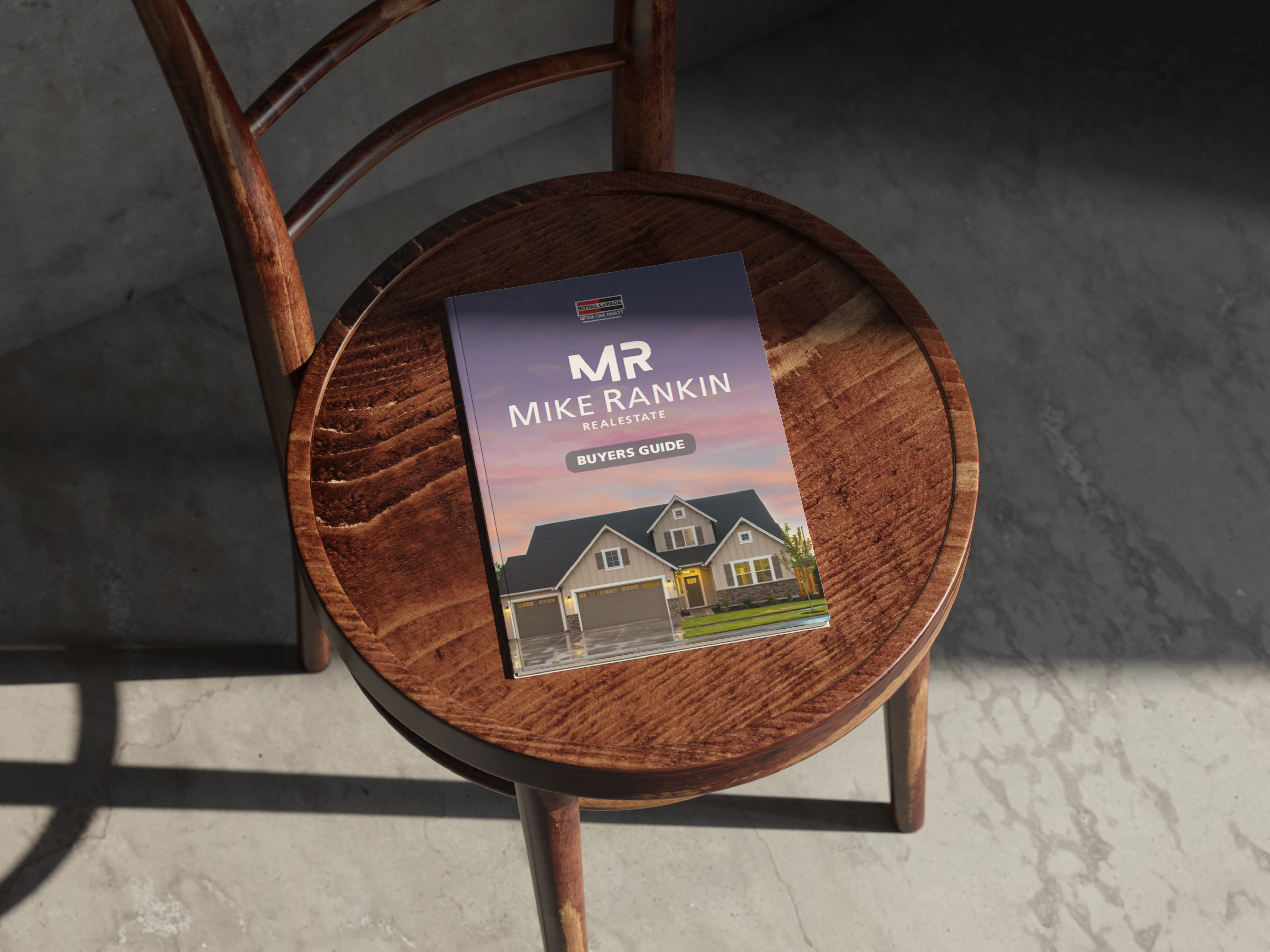
The booklets were designed for fold and staple booklet binding, a popular format for promotional brochures that is cost-effective to print and offers a seamless, magazine-like reading experience. Mike was very happy with the finished product, and now offers the items as a free download on his website, in addition to being an important tool for him at meetings with new clients.
